

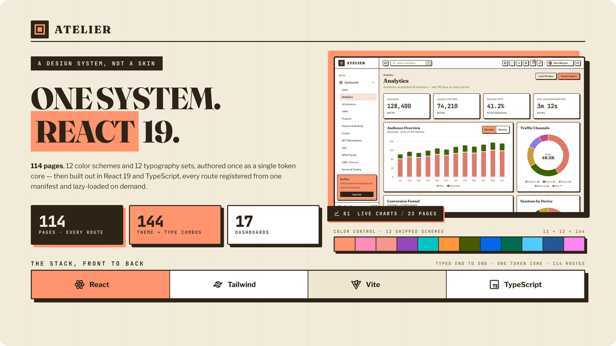
Atelier React is a premium admin & dashboard template built as one standalone
React 19 project — TypeScript in strict mode, React Router 7, Vite 6 and
Tailwind CSS v4 — with 114 finished pages off a single
design-token core. Not markup wrapped in a component shell: function components and hooks
throughout, every route lazy-loaded, every page typed.
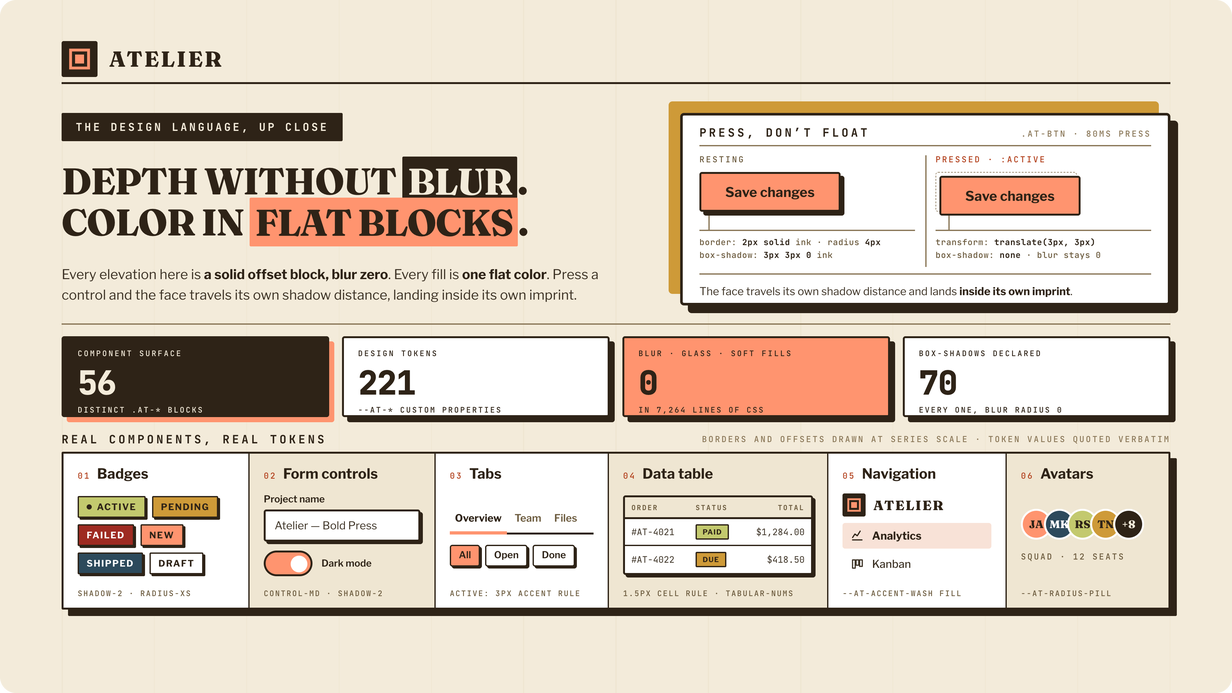
It also looks like nothing else in this category. Atelier is drawn in a pressed, editorial style we
call Bold Press: flat color, hard 2px keylines, and elevation made of solid offset blocks
with the blur set to zero. Press a control and its face travels its own shadow distance and lands
inside its own imprint.
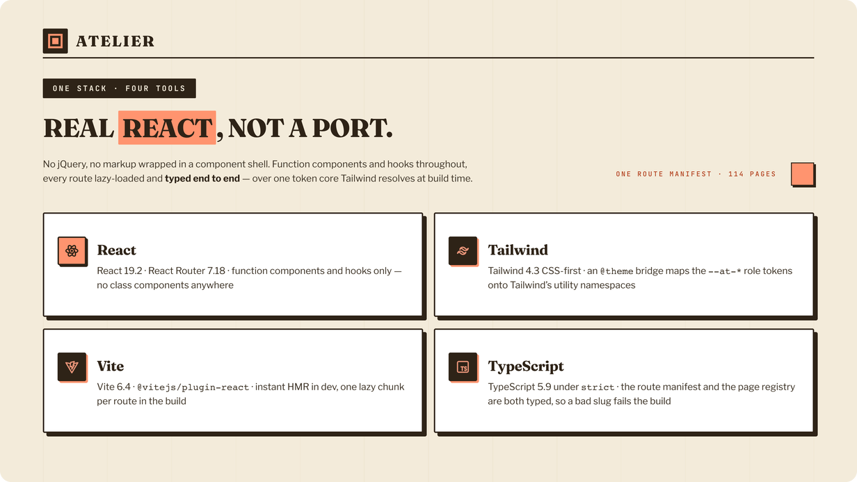
Real React, not a port
Every interactive part of the interface is a React component or hook — the collapsing sidebar, the
dropdowns, the modals, the offcanvas customizer, the ⌘K command palette, the chart wrapper
and the map. There is no jQuery, no Bootstrap, no CSS-in-JS and no third-party component library
whose look you would have to fight.
- React 19.2 · React Router 7.18 — function components and hooks only, no class components anywhere
- TypeScript 5.9 under
strict— the route manifest and the page registry are both typed, so a bad slug fails the build - Vite 6.4 ·
@vitejs/plugin-react— instant HMR in dev, one lazy chunk per route in the build - Tailwind CSS v4 — CSS-first, with an
@themebridge mapping the--at-*role tokens onto Tailwind’s utility namespaces - Six runtime dependencies, and two of them (ApexCharts, Leaflet) load only on the routes that use them
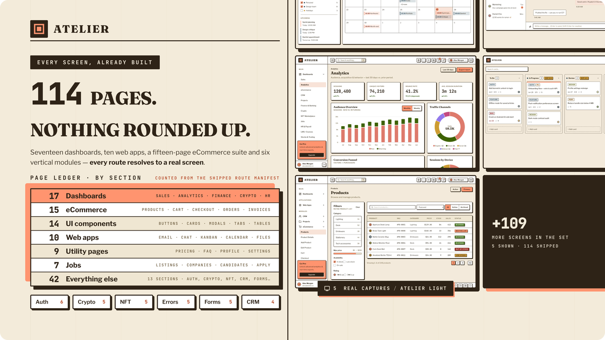
114 pages. Nothing rounded up.
Not a stack of demo widgets, and not a page count padded with variants of the same screen. Every
route resolves to a real, finished page:
-
17 dashboards: Sales, Analytics, eCommerce, CRM, Projects, Finance &
Banking, Crypto, NFT Marketplace, Jobs, HR & Payroll, LMS / Courses, Stocks & Trading,
Healthcare, POS, Social, School and Podcast -
10 web apps: Email, Chat, Kanban, Calendar, File Manager, Gallery, Notes,
To-do, Contacts and Media Player -
A 15-page eCommerce suite: products, product detail, add / edit product, cart,
checkout, orders, order detail, customers, sellers, invoices -
14 UI component pages: buttons, cards, modals, tabs, alerts, avatars, badges,
tables and more -
9 utility pages: pricing, FAQ, profile, settings, team, timeline, terms, a
landing page and a blank starter -
Six vertical modules on top of that: Jobs (7 pages), Auth (6), Crypto (5), NFT
(5), Forms (5) and CRM (4), plus error pages for 401 / 403 / 404 / 500 / 503 -
Charts, tables and maps: 81 live ApexCharts across 23 pages, data tables, and
Leaflet maps
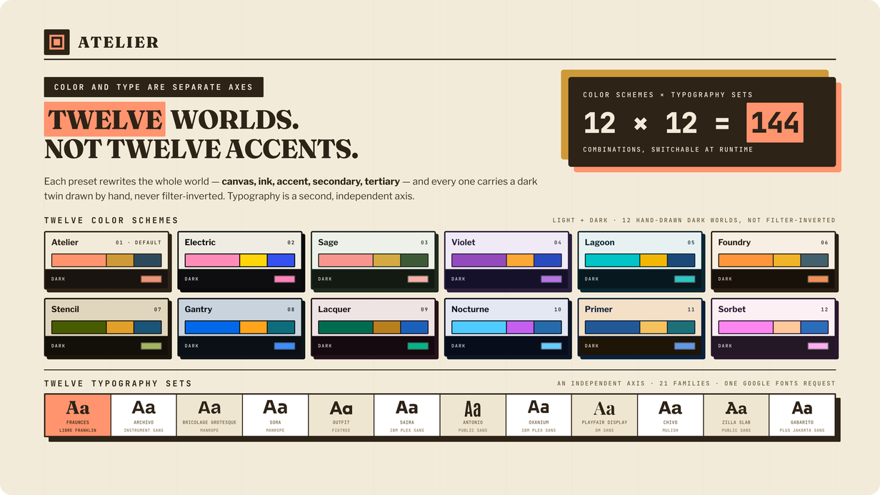
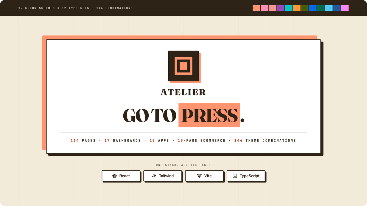
Twelve color schemes. Twelve type sets. 144 combinations.
Twelve worlds, not twelve accents. Each scheme rewrites the whole surface — canvas, ink,
accent, secondary and tertiary — and each one carries a dark twin that was
drawn by hand, never filter-inverted. Typography is a second, independent axis:
twelve type sets, 21 families, one Google Fonts request. Twelve times twelve is 144 finished
looks, and every one of them switches at runtime from the built-in customizer, with a blocking
anti-flash script so there is no flicker on first paint.
The design language, up close
Depth without blur. Color in flat blocks. Every elevation in the interface is a solid offset block
at blur zero, every fill is one flat color, and the whole thing resolves 221 CSS custom properties
across 13 stylesheets. 70 box-shadows are declared and every single one has a blur radius of 0 —
that is the design language, stated as a number.
Engineered, not skinned
-
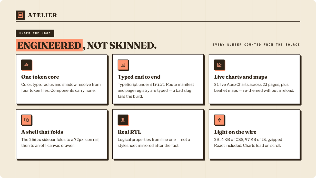
One token core. Color, type, radius and shadow resolve from four token files.
Components carry no values of their own, so a re-theme is a token change, not a
find-and-replace. -
Typed end to end.
strictmode with unused locals and parameters
on, andtsc -bruns before the bundler — a type error fails the build rather than
shipping. -
Real RTL. Logical properties from line one, not a stylesheet mirrored after the
fact — zero left/right margins in 7,264 lines of CSS. Flip direction without touching your
markup. -
A shell that folds. The 256px sidebar folds to a 72px icon rail and then to an
off-canvas drawer, at 992 / 768 / 520. -
Light on the wire. 20.4 KB of CSS and 97 KB of JS, gzipped — React itself
included. Charts and maps are separate chunks that load only when a page needs them. -
Live customizer. Color scheme, dark mode, typography, layout width and
direction, all switchable at runtime and persisted — then copy the config to make it your
default. -
One route manifest. 114 routes from one JSON file, read by the sidebar, the
breadcrumb and the command palette. Adding a page is adding a file.
What’s included
- The complete React project in template/ —
src/,public/,index.html,package.json,vite.config.tsand the TypeScript configs - All 114 pages, off one shared route manifest
- The full design-token core, documented — 12 color schemes and 12 type sets
-
HTML documentation: getting started, installation, project structure, theming, adding pages and
deployment - License and credits inside the documentation
Requirements
- Node.js 20.19+ or 22.12+ (the floor is Vite 6’s) | npm, yarn or pnpm
- Nothing on your server —
npm run buildemits static files
Documentation & support
The template ships with step-by-step setup, theming and deployment docs. Questions are welcome
through the item’s Comments & Support tab.
Note: demo photos, avatars and illustrations are placeholders for preview only and are not
licensed for redistribution. Please swap them for your own before going live. Bundled
open-source libraries and the Google Fonts used by the twelve type sets — Fraunces, Libre
Franklin and JetBrains Mono in the default set — are credited in the documentation.