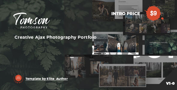
Tomson – Creative Ajax Showcase Photography Portfolio Tomson – Creative Ajax Showcase Photography Portfolio is perfect if you like a clean and modern design. This template is ideal for designers, photographers, and those who need an easy, attractive and effective way to share their work with clients. . If you like this template, please don’t
Photography Website Templates
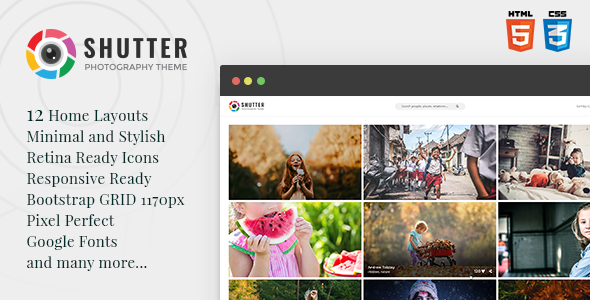
Shutter – Photography HTML5 Template
Description Shutter is clean, beautiful, HTML5 Photography Template, which can be used for Photographer, Portfolio, Personal Website, Product Website, and much more. Shutter includes different unique Homepages, that are well organized. Made with love & passion, inspired by nature Shutter will help you catch more visitors and potential clients. 40+ HTML files included. Template content
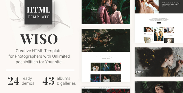
WISO – Photography HTML Template
We present you an awesome photography HTML Template – WISO. With it, you can create your own unique and beautiful site of photographer, blogger, photography agency or photo studio. Various galleries will show the uniqueness of your work and a simple and convenient store – to sell your valuable photos. We try to set many
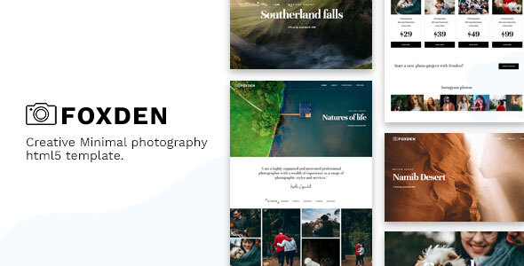
Foxden – Photography Portfolio Template
Foxden is a responsive one-page Photography template suitable for any Photography Portfolio. Foxden will help you to make photographer, portfolio agency or other business very easily as it has been coded in Bootstrap and CSS3. It looks great with all types of devices (laptops, tablets and mobiles). Foxden Features: Respnsive Design Based on Bootstrap 4
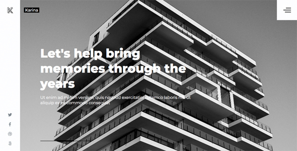
Karina — Minimalistic Website for a Photographer or Studio
Karina is suitable for hosting a portfolio of professional photographers. The simplicity and convenience of the site will not distract your customers. Using a minimum of plug-ins gives a quick download, while it will be easy for you to edit the template. Features: HTML5, CSS3, jQuery Fully Responsive Valid HTML5 Cross browser Minimal and Clean
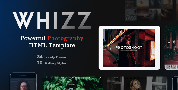
Whizz – Photography HTML Template
We are happy to present you an awesome photography HTML Template – Whizz. With it, you can create your own unique and beautiful site of photographer, blogger, photography agency or photo studio. Various galleries will show the uniqueness of your work and a simple and convenient store – to sell your valuable photos. We try
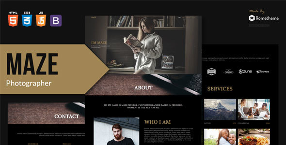
MAZE – Photography Portfolio HTML Template
MAZE is a clean, modern, and fully responsive HTML Template. it is designed for photographer, agency, personal, portfolio, businesses or any type of person or business who wants to showcase their work, services and professional way. MAZE Template’s uniqueness is due to its amazingly beautiful designs and easy to use Website template solution that maximizes
PicIt – Photography And Photographer Fullscreen HTML Template
PicIt created for Photographers, Photography studio and for all types professionals related with the photo industry. You can also use PicIt like portfolio template and use blog pages. Features 7 demo versions with vertical and horizontal menu Revolution slider included (save 16$) Fully Responsive on all devices Clean code and easy customizable Dark & Light
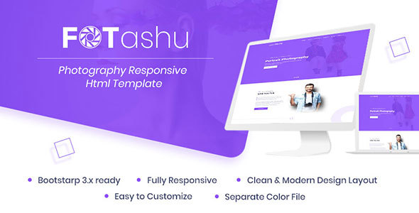
fotashu – Photography responsive html template
Introduction Fotashu is a responsive, and high-performance Photography, Videography, and Portfolio html template with awesome features. It’s based on Bootstrap and contains a lot of components to easily make a classic website. Template features: HTML5 and CSS3 25+ Valid Html Pages Bootstrap v3.x Ready Portfolio Ready Html Image and video Popup Image Gallery and Filter
PicIt – Fullscreen HTML Template
PicIt created for Photographers, Photography studio and for all types professionals related with the photo industry. You can also use PicIt like portfolio template and use blog pages. Features 7 demo versions with vertical and horizontal menu Revolution slider included (save 16$) Fully Responsive on all devices Clean code and easy customizable Dark & Light

