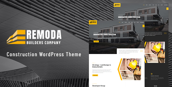
Remoda is very light and clean Construction WordPress Theme. The theme is ideal for any type of architects, interior, exterior, construction, Portfolios, builders websites and other. People those who need an easy way to share their work with clients.
Remoda is fully responsive and designed with high-end research in mind so naturally, it is a theme for mobile-friendly websites and applications, every single feature and page element will look amazing on the screens of tablets and mobile phones. It includes page templates and layouts created specifically to be the responsive visual environment on the market today.
We built this theme including Visual Composer page builder plugin, a very convenient drag-n-drop Page Builder for WordPress. It should provide you with the reliable experience while creating your website with this theme. It’s include lot’s of page builder options and widgets so that you can create unlimited demo and able to create your own design outlook. The demo you are looking it’s the example. Remembering the customer need we developed light and dark version of the theme.


Theme Features
-
Layout and Pages
It is well-known the layout system is crucial for site’s visitor to have easy access to valuable and important information. In the theme we use some effective layout system, so that it can arranging lot’s of content. It’s also easily to understand for customize. As example for home page we use Front-Page Template so if you want to arrage a new home page then after create a page you have to select Front-Page Template from page attribute section in admin panel. There have more option for other pages use, you can use it as the different of pages. Just added the list of the template down:
- Default Template – it’s WordPress builtin template.
- Blog Page Template – Use for blog page here all News, showing all blog grid.
- Front-Page Template – Use for home page or Landing page.
- Full Width Template – Use for full width page or where have no sidebar and if you want to create any custom page.
- Sidebar Template – Use it where have the sidebar, for inner pages where have sidebar nav.
-
Grid System
We use the grid system perfectly in the theme. The grid system and all the elements are completely responsive. It’s well and functionally organize.
-
Modern and Professional
As a modern and professionally use Patron is a best choice. Because for the corporate, business and service related site, it’s very important to keep the lot’s of content arrangement and easily to read. In Patron content management is very simple and you can keep lot’s of content easily.
-
Responsive Issue
Patron is completely responsive and mobile friendly. It’s pixel perfect in any devices. If you open in mini device, you don’t loss or miss any content. All of the content of this theme we successfully keep in small deceives.
-
Easily customization
It’s very easy to customize. Because in the admin panel have lot’s of option and widgets. For the content arrangement inside the visual composer we have added custom widget. Also if you need any different option and widget specially, you can contact with use our expert team will do it specially for you.
Extended Features List
- Cross-browser compatibility on most platforms
- 30+ Page layout including home page
- Modern, Clean, Minimal & Professional Design
- Coded with SEO in mind: beyond the SEO Meta description from Theme Options, you have a specific SEO field on each Post, Page or Project
- All layers are grouped and sorted
- Pixel-Perfect – No half pixels
- Nicely Layered & Grouped with proper Names
- Easily customization
- Super Clear and Clean Layout
- Excellent and Creative Design
- Easy to edit and customize
- Smart Objects Included
- WooCommerce full design integration for online shops
- Contact Forms enhanced by powerful & easy-to-use WPForms Plugin
For each settings we added Redux Option framework, with this framework you can control and manage the website easily. Also if you require any special settings, we will do it for you.
The web is generally defined by being a typographic environment. This is why we included in theme the Google Fonts Uploaded where you can add over 800 of free Google Fonts to use in your theme and, as you know, the number of Google Fonts increases so often. We’ve made it so that all the font weights could be loaded in separate fonts to best fit your needs and provide you with more choice and better overall site performance. Beyond of this, enjoy the advanced typography features both in Theme Options (font-sizes, colors, or line-heights) and by using Custom Content short-code, where you are able to adjust size, weight, letter-spacing, line-height, text-decoration, colors and much more options.
In the theme, there used 2 types of awesome galley style. Using the gallery layout your can view the image and also see the details of the gallery. There also include 3/4 gallery page layout style. Each of the gallery have hove effect and animation effect that you can control through theme options.
As the theme option, there have include Redux Framework plugin. It’s very easy and simple to customize the theme. With each option there have the description and instruction. Also set default settings and turn into default button. So that you can easily return style as default format. About the theme option, we give a good instruction inside the documentation. Also if you have any question about it, you can ask in our support email.
With the each section and content, there include the parallax animation effect. There animation option is include with the visual composer widget. So we you use the visual composer custom widget and call animation effect, you will get a option for animation add with that content. By that option you can set the animation and set the variation of the animation.
As the icon we have use the flat icon. All the flat icon has keep in icons folder of the theme. And also provide the instruction how to add the flaticon, in the documentation.
For email system and Quote email we use the contact form7 you can easily customize your form content from the admin panel Contact menu under the Comments nav.
In Patron, there include 2 style blog. There have a blog settings in Patron Option at the bottom of the option there have a blog style drop-down, for blog thumbnail style. Select one style from those 2 and save then it’s change the blog thumbnail style.
Some Advantages of the Project:
- Based on 1920px screen / 1320 grid system / Full-screen components.
- Pixel Perfect Design.
- Modern and Unique Design
- Perfect Color Combination
- Only free Google Fonts are used.
- Flat icon for icon source.
- Remoda can get only on Envato Market.
Note
- The images included in the demo site are for showcase only, as they are licensed, and not distributed in the package. They have been replaced with other free to use images
- Browser support: Chrome, Opera, Firefox, IE11, Edge, Safari
Google Fonts are Used:
Before as you start edit the template be sure to install the font.
PLEASE don’t forget to rate it.
Thanks so much!


